
eCommerce UX/UI Design: Principles That Improve Conversion
Practical navigation, product page, and checkout principles that support conversion.
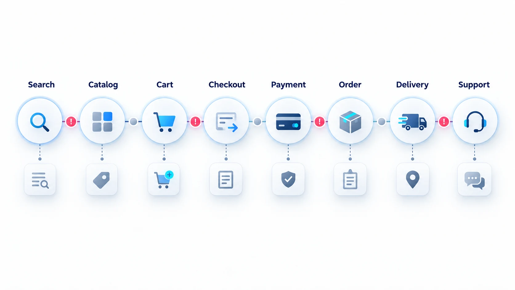
Good eCommerce design reduces the effort and uncertainty involved in buying. It helps customers find relevant products, understand differences, trust the offer, complete payment, and recover when something goes wrong.
Conversion does not come from decorative interface trends. It comes from aligning information, interaction, performance, and commercial rules with real customer decisions.
Begin with evidence
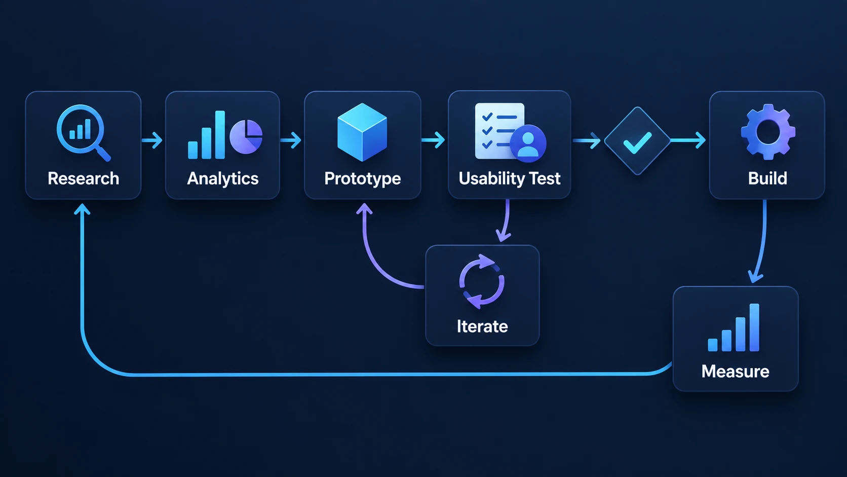
Use analytics, search queries, support tickets, session observations, interviews, and usability tests to identify friction. Separate symptoms from causes: a high product-page exit rate may reflect poor traffic relevance, unclear availability, insufficient specifications, slow performance, or an uncompetitive offer. When latency is the cause, the performance and reliability scope addresses the system rather than the interface copy.
Define success for each journey. Useful measures include search success, add-to-cart rate, checkout completion, error rate, return rate, task time, and support demand. Do not optimize a single metric at the expense of trust or profitability.
Make navigation match customer thinking
Organize categories around shopping goals and product differences customers recognize. Keep labels specific and consistent. Avoid internal department names or overlapping categories that make users guess.
Filters should reflect meaningful attributes and available inventory. Show applied filters clearly, allow easy removal, preserve state, and avoid combinations that lead to confusing empty results. Search should tolerate common misspellings, synonyms, model numbers, and SKU queries where relevant.
Design product lists for comparison
Product cards should expose enough information to decide whether an item deserves attention: image, name, relevant variant, price, availability, rating where credible, and the attributes that distinguish options.
Do not overload every card with secondary actions. Prioritize scanning and comparison. Make promotional labels precise; vague urgency damages trust.
Answer purchase questions on product pages
A product page should explain what the item is, who it is for, what is included, which variant is selected, what it costs, when it can arrive, and how returns work.
Use high-quality media and structured specifications. Place critical information near the decision point without hiding details customers need. Variant changes must update price, media, availability, and identifiers accurately.
Calls to action should be visually clear, but clarity is not merely color. Button text, surrounding information, enabled states, loading behavior, and error recovery all matter.
Treat the cart as a decision checkpoint
The cart should summarize products, variants, quantities, discounts, estimated costs, and fulfillment expectations. Make editing safe and reversible. Preserve the cart across sessions where appropriate.
Cross-sells can be useful when they solve a related need. They should not obscure the primary path or introduce uncertainty about the order.
Reduce checkout uncertainty
Checkout optimization is not simply removing fields. Ask only for information needed at the current stage, use appropriate input types, explain requirements, validate without erasing data, and support guest checkout when the business model permits it.
Show shipping options, taxes, fees, and delivery expectations as early as accuracy allows. Provide familiar payment methods and clear recovery for declined or interrupted payments. Prevent duplicate submissions and make order confirmation unambiguous.
Design mobile commerce deliberately
Mobile layouts need more than stacked desktop components. Prioritize readable product information, reachable controls, stable layouts, efficient filters, suitable keyboards, autofill, and payment methods that reduce typing.
Test on real devices and constrained networks. Large scripts, shifting content, and delayed controls can make an interface technically responsive but practically unusable.
Accessibility improves core usability
Use semantic headings and labels, keyboard support, visible focus, sufficient contrast, alternative text, and programmatically announced status changes. Dialogs, menus, filters, carousels, and custom selectors require particular care.
Accessibility testing should combine automated checks with keyboard and assistive-technology review. It is a product-quality discipline, not a launch-day patch.
Build trust with precise content
Show contact, delivery, returns, privacy, security, and company information where customers need reassurance. Reviews and ratings should be authentic and contextual. Avoid false countdowns, preselected add-ons, hidden fees, or language designed to shame users.
Trust also depends on consistency: prices, availability, promotions, and order status must agree across the storefront, messages, support, and back-office systems.
Connect design and development
An eCommerce website design and development process should define components, states, responsive behavior, content rules, accessibility, performance budgets, and analytics events. Designers and engineers should validate feasibility before the interface is considered finished.
Reusable design systems improve consistency, but commerce components must support real data: long names, missing images, multiple currencies, sale prices, complex variants, and validation errors.
Improve conversion responsibly
Prioritize issues using evidence and expected impact. Test meaningful changes with adequate sample sizes, but do not delay obvious defect fixes while waiting for an experiment. Review downstream measures such as refunds, support contacts, and margin.
Flexor connects storefront UX with B2B and B2C eCommerce store development, including responsive states, accessibility, performance budgets, and analytics. Explore all eCommerce development services and learn about the team.
Frequently asked questions
What is eCommerce UX design?
eCommerce UX design shapes the complete shopping journey—discovery, evaluation, cart, checkout, account, and post-purchase tasks—so customers can act accurately and confidently.
What is the most important checkout improvement?
There is no universal answer. Unexpected costs, forced registration, poor error handling, unsuitable payment methods, and slow performance are common sources of friction and should be investigated with data.
Does better visual design increase conversion?
Visual clarity can help, but aesthetics alone do not guarantee improvement. Relevance, offer quality, content, speed, trust, availability, and usability all influence conversion.
How often should an eCommerce UX be reviewed?
Review it continuously through analytics and support signals, with deeper research around major releases, new markets, catalog changes, or unexplained performance shifts.
What should an eCommerce prototype test?
Test uncertain decisions: navigation, filtering, product comparison, delivery promises, checkout errors, account recovery, and post-purchase status.
How are UX and Core Web Vitals connected?
Slow loading, layout shifts, and delayed interaction directly change what customers can perceive and complete, so performance is part of experience quality.